 Brandon Pearce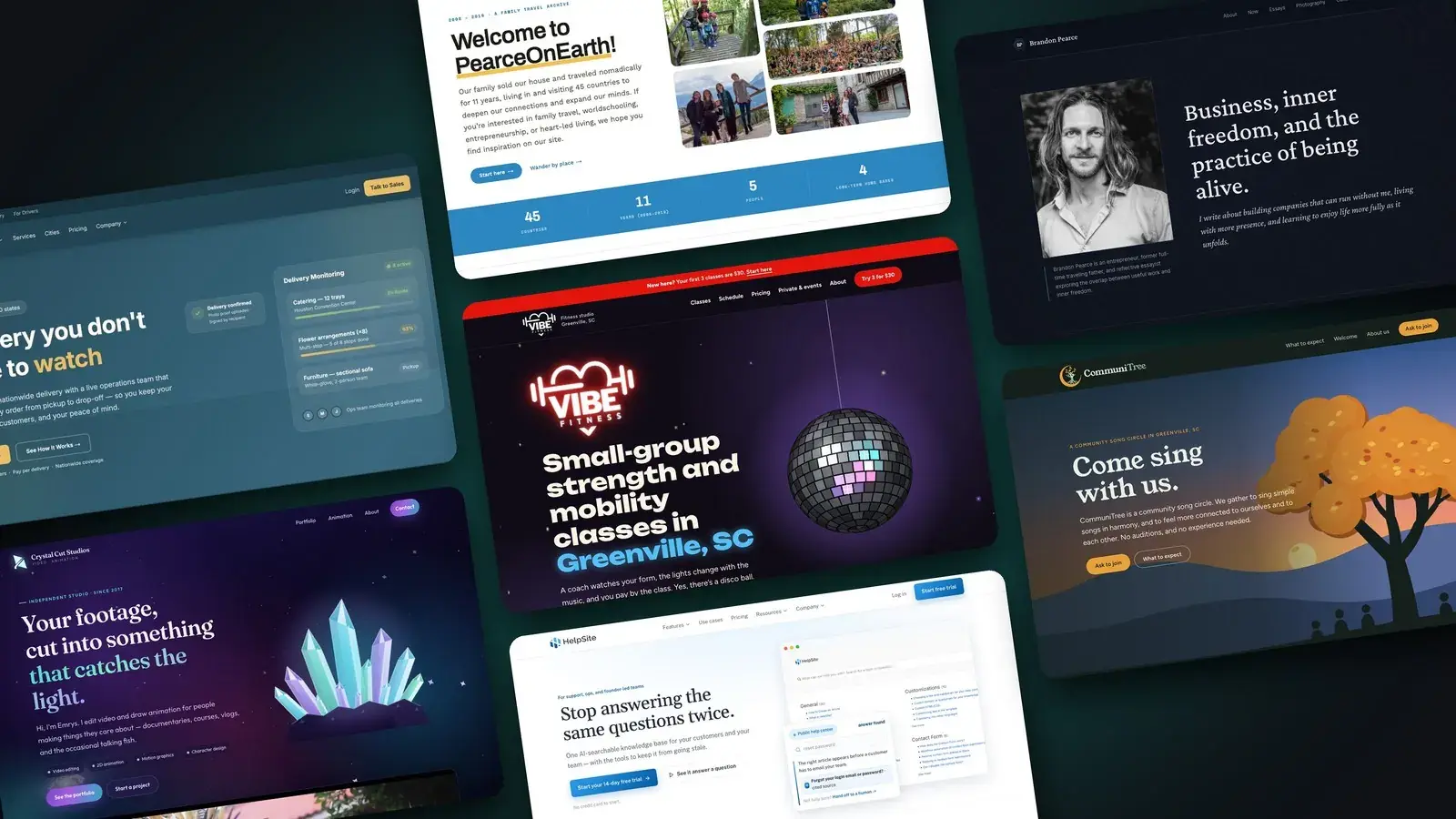
In May, I wrote about how I rebuilt this website with AI in six hours. I ended that post by saying that if you've been thinking about building your own website, you should just ask your favorite AI to help.
I still believe that.
I've also just started a business building websites for other people.
It's called Beautiful & Fast, and you can find it at beautifulandfast.com.
Both of those things are true, and I'll explain why. But first, a little history.
Where this started
I built my first websites in the late '90s in plain HTML, then in FrontPage, then Dreamweaver. In 2001 I started my first company, Brandags, Inc., designing and hosting custom websites for clients. I'd lay out every page in Photoshop, slice it into image chunks, and hand-code the rest.
Then I learned PHP and started building web apps. I was teaching piano at the time, and one of those apps became Music Teacher's Helper, the software business that eventually funded our eleven years of travel and set me on the entrepreneurial path I've been on ever since.
Somewhere along the way, I stopped building websites myself. I hired designers and developers, managed teams, and ran software companies. I hadn't written much code in over a decade.
Seven websites this year
This year, I rebuilt the websites for UniHop and HelpSite, the two businesses I run now. Then this site. Then Pearce on Earth, our family's old travel blog. Then a portfolio site for Crystal Cut Studios, a video editing and animation studio. Then a local gym and a community choir, which I'll get to in a minute.
Somewhere around the third one, I noticed I was having more fun than I'd had at work in a long time.
Of everything I do across the businesses I own, the part I enjoy most is the design. I love taking ugly things and making them beautiful. I love taking inefficient things and making them efficient. And I love taking ineffective things and making them effective, so the site does the job it's there for, whether that's bringing in a lead, selling something, or helping a visitor understand what you do.
Beautiful, efficient, and effective. That's what Beautiful & Fast is built around.
Last year I wrote that my work doesn't have to be my calling, as long as it's aligned. I don't know yet whether web design is a calling. But it's the most aligned my work has felt in years.
Why AI made design fun again
I used to do all my design by hand in Photoshop. I've played with Figma a little. These days I find those tools tedious. Nudging boxes around one pixel at a time was never the part I loved.
With AI, I can describe an idea in a sentence, see it on the real site in a few minutes, and try three more versions before lunch. I can play with animation, which used to cost enough that most small sites never got any.
My favorite example so far is the website for CommuniTree Choir, a community song circle I'm starting here in Greenville. (More on the choir itself in my next post.)
When you open the site, it's sunset over the Blue Ridge foothills. As you scroll, the sun drops behind the ridge, the stars come out, and a crescent moon rises. An owl flies down and lands on a branch of the tree. A campfire lights up in the middle of a circle of singers. If you scroll back up, the owl flies away.
The tree also follows Greenville's seasons: magnolias in spring, fireflies on summer nights, falling leaves in autumn, and snow in winter.

The whole scene is drawn in code. There's no video and no image files in it, and the entire home page is about 250 KB, smaller than a single photo on most websites. It went from first line of code to live in four days.
Twenty years ago, I couldn't have built that for a small community choir. Nobody would have paid for it.
Fast because of the process
When I tell people a site went live in four days, some assume I typed a prompt and got lucky.
The speed comes from the process more than the AI. An AI does good work when it knows exactly what it's building and what good looks like. So before any design starts, I write down who the site is for, the one thing a visitor should do, how the business sounds, what each page needs to be found for in search, and which old addresses need to redirect to new ones.
Underneath that, I've built a framework the AI works inside: the technical foundation, hosting, and search setup every site starts with, a content structure that keeps the words separate from the design, and written rules for design, voice, and quality. Then I review what it makes, push back, and refine.
That system came from 25 years of building websites and watching what breaks. I couldn't have written it without that experience, and it's the reason the results hold up after launch.
Beautiful, efficient, and effective
Design is what people notice first. But a beautiful site that loads slowly on a phone loses people before they see it. A site Google can't read doesn't get found. And a site the owner can't update without breaking it gets stale, then embarrassing.
Vibe Fitness, a strength studio here in Greenville where I've taken classes, is a good example of all three. Here's their old homepage:
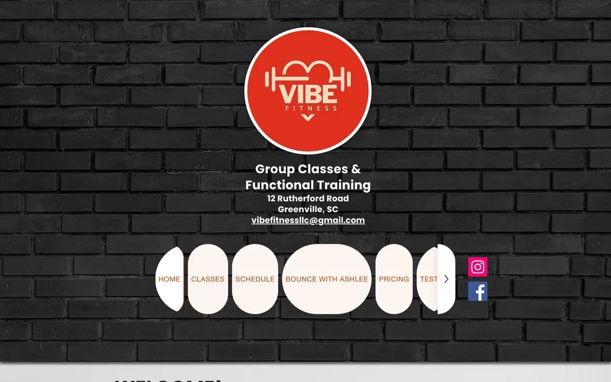
It didn't do the studio justice. The headline was "WELCOME!" with no button. The pages describing their classes and coaches were pictures of text, so Google and AI assistants couldn't read a word of them, and changing a class description meant editing an image. Signing up for a first class took six steps across two websites.
The studio itself is a fun room to walk into. There's a sprung floor, hexagon lights on the ceiling, colored lights that change with the music, and a disco ball. The owner redecorates for every holiday.
I wanted the website to feel like walking into that room:
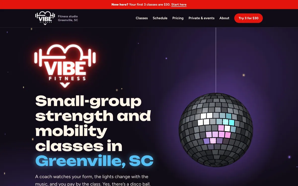
The disco ball is drawn in code. The accent colors cycle through the studio's lights. The decorations follow the calendar the way the owner's do, with hearts in February, bats in October, and snowflakes in December.
Under the fun, every class has its own readable page. The "3 classes for $30" intro offer is on every page. And the schedule is built from the class pages, so a time change happens in one place. They're finishing up the content now, and you can see more of the work here.
Every site I build also gets the parts visitors never see: fast load times, page titles and descriptions written for search, structured data that tells Google and AI assistants what the business is and does, redirects from every old address so existing links keep working, and accessibility checks.
"Can't I just do this myself with AI?"
Yes, you probably can.
Like most skills, it's learnable. If you enjoy design, and you also enjoy the technical side (hosting, security, search, performance, and the dozens of small decisions that go into a site), you can build your own. That was the point of my May post, and I meant it.
You can also ask an AI to build it for you, and it might come out fine. The catch is that you can only judge what you can see. You'll know whether you like how it looks. It's much harder to know whether it's fast on a phone, whether Google can read it, whether your old links still work, or whether it's secure. And then someone still has to host it, maintain it, and keep it updated.
Updating is where a lot of small business websites go wrong. In Wix, WordPress, Squarespace, and Shopify, the same editor that lets you change your words also lets you break your layout, and plenty of owners stop touching their own sites because of it.
I build sites where the design is protected in the code. Some clients send me a change and I make it, often by chatting with an AI that's connected to the site. Others get a simple editor where they can change the text and photos on their own, without worrying about breaking the design.
I could probably figure out how to fix my deck behind the house. I could spend my fall weekends blowing leaves out of the yard. I'd rather pay someone who's good at it and enjoys it, and spend that time on what I'm good at and enjoy.
I'm betting there are people who feel that way about their website. They want someone with experience and a good eye to understand their brand, build a site that feels like them, and make sure it brings in the customers, leads, or students it's supposed to.
Prices on the website, fewer sales calls
I'm not a phone person, and I don't enjoy long sales calls, especially with people who were never going to buy.
So I put the pricing right on the website. You choose how many pages you need and which features you want, and it shows you the price. A three-page site (Home, About, and Contact) with a custom design starts at $799 to build, plus $99 a month for hosting, care, and routine edits. If you'd rather not pay for the build up front, you can spread it into a monthly plan instead.
Once you've seen the number and sent the form, I'm happy to hop on a short call to work through the details. I'd just rather you know what you're getting into before we talk.
A few other things I care about:
- Every design is custom. It's drawn for one business and never reused.
- It's quick. The build takes about a week once the content is ready.
- You own it. The design, the content, and the code are yours. If you ever want to leave, I'll hand everything over and help you move.
Five questions to ask about your own website
Whether or not you ever hire me, these are worth a few minutes:
- Open it on your phone. Does it load in a couple of seconds? Could a stranger tell within five seconds what you do and where you are?
- Look for the next step. Is there one obvious thing to do on every page, like book, call, buy, or try a class?
- Search for yourself. Type what you do and your city into Google, or ask your favorite AI. Do you show up, and does the result describe you correctly?
- Try to change something. Could you update a price or a photo in five minutes without worrying about breaking the layout?
- Imagine sending it. Would you be proud to send the link to your best customer?
If a few of those made you wince, that's useful to know.
How you can help
Marketing is the part of this I'm least excited about. I know how to do it. I just don't enjoy it the way I enjoy building. So I'm hoping to start the way a lot of small studios do, with people who already know me.
If you have a website you're embarrassed by, or one that isn't bringing you customers, take a look at the work and build an estimate.
If you're not sure whether your site needs work, I offer a free website check-up. I'll score how it looks, how fast and easy it is to use, and how clearly it guides people toward becoming customers, and send you a short report on what to fix first. Sometimes the answer is that you don't need me yet, and I'll tell you that.
And if you know someone who needs a better website, maybe a friend with a studio, a local restaurant, a small software company, or a coach or artist whose site doesn't look like their work, I'd be grateful if you'd forward them this post or send them to beautifulandfast.com.
Invitation
What's something in your life or work that you've been putting up with because fixing it felt like more trouble than it was worth?